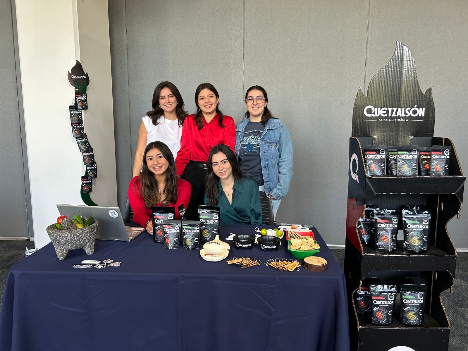
Brief
"Develop a complete brand identity for a new dehydrated salsa product. This includes creating a name, designing a logo, and developing graphic elements for promotional materials such as floor stands and other marketing assets. The target audience is young individuals, particularly those living abroad (outside Mexico), or busy professionals who appreciate the convenience of ready-to-make salsa."


Solution
The brand name, Quetzalsón, cleverly plays on the phrase "¡Qué salsón!" to evoke excitement and flavor, while also referencing the quetzal—a vibrant symbol of culture and heritage that, according to legend, rose from ashes (just like this salsa is brought to life from its dehydrated form).
Logo
The Logo uses the "Q" from QUETZALSÓN to represent Quetzalcoatl breathing fire, with its tail taking the shape of a chili.
Graphic Elements
The branding features vibrant, playful patterns inspired by the key ingredients of green and red salsas. Bold colors and modern designs make the product visually appealing to younger audiences while celebrating its authentic flavors.


Two stand variations were designed to showcase the product effectively.


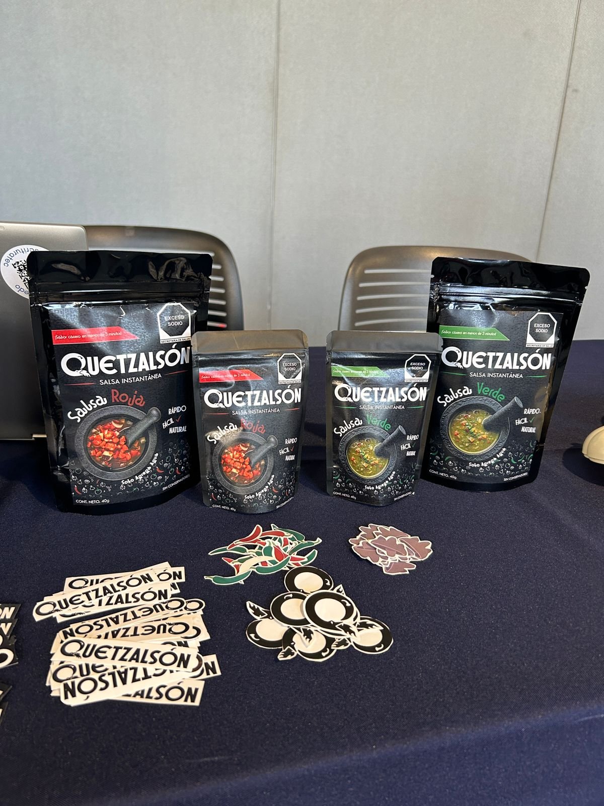
Packaging Labels


Mockups